Showing posts with label paint. Show all posts

Thursday, February 28, 2013

Painted Headboard

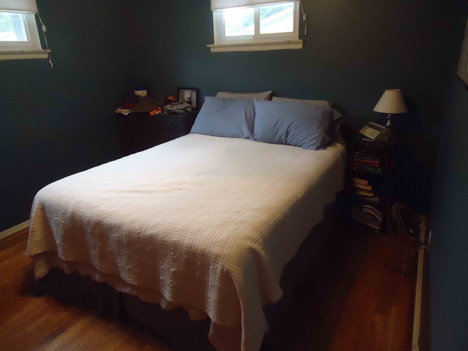
I talked about the hows and whys of changing the boys' room in this post.
 
Today I'm just going to explain how I made the red stripe on the painted headboard without measuring.

I did use a level to make the navy rectangle. Pretty standard stuff. But I wasn't about to measure and use the level and mark to figure out my red line. Too much work.

First, I bought one and half inch wide painter's tape because that is about how far in from the edge I wanted the line to be.
I placed the tape right on the edge of the navy blue all the way around. Then to get a crisp edge I burnished the tape with my finger nail, but you could use a tool such as a popsicle stick. Just rub down the edge. I don't have a picture because it hadn't yet occurred to me to do a post on this when I did that stage. Oops.

(Walls aren't smooth and painter's tape is designed to grip very lightly, so you burnish to force the tape into all the mini divets in the wall.)

I settled on a 1.5" stripe of red, so I tore bits of tape and spaced them out around the first tape line. I lined the edge of the tape bits to the edge of the tape line.

Then it was time to take advantage of the straight line quality of tape. I simply connected the dots, so to speak. My next tape line was placed carefully along the edge of the tape bits.
I used an x-acto knife to trim tape that when over.

Once in place, I removed the tape bits which were now sandwiched between my long tape lines. I then burnished the tape.

For such a small space I just bought a sample size of red paint. It did take five coats to go over that dark navy color. But red usually takes at least three coats anyway.

Once the paint was dry, I pulled off the tape. I pull straight off. Not at an angle either way, just straight.      

Friday, January 4, 2013

Ashes to Ashes

Have no fear! No one died in the making of this post...except maybe my pride.

I want to be done with a room. As much as I love trying out ideas, I'd like at least one room to just be done. You know? And I thought I was almost there with the living room.

So, here's what happened. I found this picture on Pinterest:
It's called Revere Pewter.

And I knew that I was thinking grey and this looked perfect! I headed over to my local Ben Moore paint store and asked for help locating the color...and...

it was totally beige. 


And it's not just me. The color is in the neutrals, but not next to the distinctly grey colors. I looked at it in various light, and even in our house it still looked beige.
Like this picture


My accents are similar, and see how beige and not grey that looks?


All greys are going to lean towards a color family. It's the whole black being the sum of all pigments thing. Given the orange accents, I decided to pick a grey that would lean toward blue.(For why, check out this post.) I went with Coventry Grey:


Well, it doesn't seem so in this picture or the color sample, but it leans toward blue. It's weird. It depends on which wall you are looking at, how the light hits it, whether it looks blue or grey. And when it looks blue it feels really cold. 

Sorry, for once this winter we were having a super sunny day, but the walls I haven't touched are the window walls.

I wasn't completely convinced, but I was busy with school and we thought we'd live with it for awhile. We did like it better than the yellow we had before.


Then I finally painted the hallway. The hallway just looks blue. Which makes me think the whole living room looks blue every time I see it now. Sigh.

I scurried over to Home Depot. Sorry Ben Moore, but if I'm changing my mind this much, I don't need fancy-pants expensive paint. I decided to look over their greys. Every time I selected a warm grey, it looked very beige to me. I finally settled on 'Ashes.' It looked grey, but slightly warmer, definitely not blue, it leans toward violet, but you have to really stare at it to see that.

I bought a quart. A sample is cheaper, but I needed to paint whole walls to decide. However, I wasn't going to paint everything - just a wall in the living room and a wall in the hall.

Here's a corner where I painted both walls Ashes, the green is the kitchen. Let's not discuss the half done crown molding. ;)

And I can't decide! It's grey and not blue, so that is good. Otherwise it's bascially the same color.

As if it's not hard enough to decide, I was looking at this pin:

Argh! Tonight I feel like I still like 'Ashes' so I'm back to the beginning. But if I'm bothering to repaint maybe I should be more dramatic and really warm up the grey. Care to weigh in? I hate being indecisive. 

I also hate that it depends on the computer monitor how the color appears, so this whole post might be moot, but I needed to vent.           


Wednesday, September 28, 2011

Master Bedroom Color Wow

The power of paint never ceases to amaze me. We hadn't touched our bedroom since we moved here, and in fact, hadn't done much for our room in many years.

So here is the before:

The green walls were there when we moved in. It was nice and bright, but I really wanted something deep and dark and cozy.

I bought that quilt 9 years ago with the plan that we would have a dark room. But we rented for so long was never practical to paint.
Gabe actually found the perfect color. He collects paint chips every time we go to a home improvement store. :) 
 
The moment I started I knew I loved it. That doesn't always happen, you know?

Love it! I can't stop admiring it when I'm in there. 

It even makes the door and closet doors look great and I figured I needed to paint them or something. So glad I did the walls first.
The color is French Gray by Glidden. Which incidentally I also really liked the low VOC formula.

We still need to actually decorate. And just ignore Matt's messy dresser. After 11 years, I have given up. I have come to terms with it. :) He needs a new dresser, I need a new night stand, we need a headboard and I'm thinking new sheets and curtains.

But for now, I just love going in there and snuggling down.

This post may be linked at the following parties (for their Blog Buttons see my Link Love page): (M) C.R.A.F.T., Amaze Me Monday, Sumo's Sweet Stuff,  (T) A Little Birdie Told Me  Stories of A to Z, The Blackberry Vine, How To's Day , Type A, Amaze Me August, , Show Me What Ya Got,  (W) Wow MeBlue Cricket Design, What I Whipped UpWicked Awesome Wednesday, Sweet Peas & Bumblebees (TH)   Creative Juice, Thrifty 101 , Smilemonsters , Everything But the Kitchen Sink, Shabby Chic Cottage, Thrifty Thursdays, House of Hepworth's,  (F) Fingerprints on the Fridge, Furniture Feature Friday,  Lovely Crafty Weekend , Remodelaholic, For the Kids Fridays, , Craft Goodies, (Sat) Tatertots and Jello , Anything Goes , Funky Junk Interiors (Sun) Creative Blog & Hop, Sundae Scoop, Under the Table and Dreaming
 

Tuesday, May 17, 2011

Tuesday's Art Adventure: Salt and Paint

There are all sorts fun things you can do with paint besides just painting. Because kids are naturally curious and love to explore what happens, this type of project is great for all ages.


Salt and Paint
Explore the effects of salt on paint.

Supplies:

  • watercolor paints (just the cheap kids kind are great)
  • brushes
  • paper
  • salt (any kind,table, kosher, rock, etc. you can even try a variety)

Work bit by bit. Paint a part of your painting


and while the paint is still wet, sprinkle with salt.


Experiment with using a little or a lot of salt. 


That's all there is to it. Keep adding paint and salt until you are satisfied. 


Leave the salt in place as it dries.
You can see how the paint pulls away from the salt.

When the painting is dry, gently brush the salt away and admire the effects. 


If your salt is stubborn, use a stiff, clean brush or even just the side of a spoon and scrap the salt off.

In the upper right corner, Chi loaded it with salt which also had a nice effect.


My kids just painted abstracts, but here's an example of mine. A close picture so you can see where I used salt in the blue paint to make it look more like water.


Friday, May 13, 2011

A copy of a copy, or something like that.

I completed a little project for the desk area in our basement.
I was inspired by Kim at Too Much Time on my Hands
and her sort of Anthro dresser.
 Here was her inspiration:

I don't know why, but I love numbers on things. I must not be the only one because numbers show up on everything all over the interwebs.

I didn't have a dresser I wanted to do, but I did have this:
I bought it at Ikea a year or so ago to store papers and such. I always thought it needed some sprucing but the quality and price were right.

I want red accents in that room, so I took Tomato Spice acrylic paint and watered it down and brushed it on. Really more of a wash. I did not want it to be "painted." I wanted some wood grain, so I used the paint as a stain.

 
That was a bit bright, so I pulled out some Raw Umber and again watering it down so it was more like a stain, I used a wet rag to give it a more distressed look.

It's really a bit "redder" than this, but the sunlight was wicked bright when I snapped this picture.
I painted numbers on the drawers and sanded them just a bit.
It's working for me. It's nice to do a small project every now and then so you get results immediately - almost.

In its natural habitat. :)

Monday, April 18, 2011

Cool and collected

I attempted to make my end tables darker, but failed
as you can see. You can read about the drama in this post.

Then the good people at Valspar had a free paint sample giveaway. Choose your own color and all. You have to like them on facebook, but I got in at the end. I believe I heard it is over now. But feel free to double-check. I can't be sure.

So, I chose Sonic Sky


with my poor end tables in mind. I thought at first I might go with a whole distressed thing, but upon the first coat of paint I was loving the clean crispness of the color.


So, I painted one and I'll live with it for a week and then decide to keep it or distress it. 
 Feel free to vote in the comments section.


 Next post, I'll explain how I knew a light blue that did not "match" ANY OTHER color in the room would work. It will be color theory 101. Stay tuned...

Linking to:
Centsational Girl

Thursday, March 24, 2011

Furniture Redo

This wicker basket dresser has been with us for almost seven years. It started out life as baby dresser/changing table. Come to think of it, I should do a post on how to make your own changing table out of a dresser. But that is not what this post is about. 

We used this for both boys until their clothes were too big to fit. I used it a short time while in between dressers, it made a brief stint as kitchen storage, and now it holds school papers and mailing supplies and has the mail organizers on top.

Actually, it is the drop zone where junk piles up. Sigh.

So, the color wasn't working for me. It was fine In the beginning... (it's hard to say that phrase normal and not all Charlton Heston-y, don't you think.) But now I'm over the mid-tone wood.
I was going to do a whole tutorial post, but seriously, it's spray paint. I don't think you need during pics. I took the basket drawers out and sanded. Then grabbed some handy-dandy black satin spray paint (I started with Krylon Satin Black, but then ran out and finished with Rustoleum Canyon Black), and sprayed light even coats. Lots of them. My hand still feels kind of crampy today.

So, what do you think? I love the black. It makes the wicker color look richer. I could have gone white, but I have little kids. For realz, they mess up white stuff. And, I already have black accents, so this was the best choice for us.

I wonder if I should paint the wood brace that goes around the wicker basket. I think I would like that, but the leather handles cannot come off, so that will be tedious work with a small paint brush and paint. So, we'll see.

Linking to:
Fingerprints on the Fridge

Furniture Feature Fridays

Tuesday, February 15, 2011

FAIL

I'm pretty good with colors. I can usually be certain of a color just by the paint chip. But since, at least for now, I'm keeping the tile in my bathroom, I decided to buy one of those testers. Glidden has these cute little bottles that are kind of like nail polish bottles of paints. It's easy peasy, you just find the one you want and for a little less than $2, you're out of there, no waiting at the counter. 
I have beige tiles from the late 40s early 50s. I'm not sure really. These tiles look suspicously like tiles that are always labeled vintage 50s, but I know the house was built in the late 40s so my guess is that these tiles have always been there. And for the most part, they are in good condition.
I'd like to take it out, but I don't have the time, energy, or money to deal with that mess. So, working with beige it is. I thought about blue, but everybody and their brother and second cousin twice removed has a blue bathroom. I like to be different. (No offense if you have a blue bathroom because it usually looks good. I just don't want one. Okay? Friends again?) I decided to go with gray, but would gray work with the tile, I wondered? I kind of wanted a dark gray. Enter, the Glidden tester in Seal Gray...

...and FAIL! It doesn't work at all! Boo.
So, now I have dark gray (Deathstar Gray, people, not Seal, Deathstar) in my bathroom. Now I'm really motivated to fix it. I'm going back for a light gray with blue undertones. Wish me luck. It wasn't on the agenda, but apparently this week, I'll be painting a bathroom. ;)